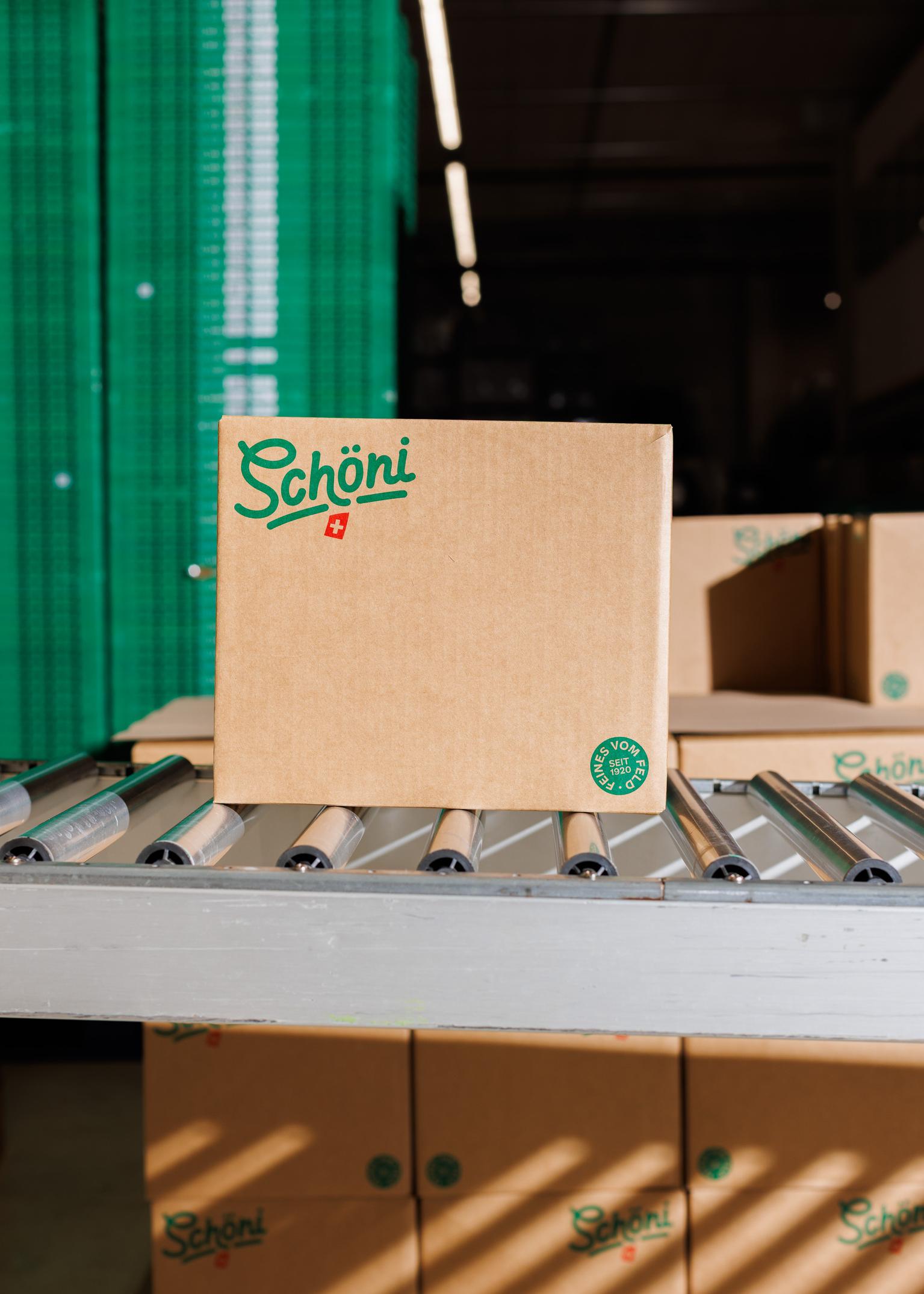
A clear presence, strong roots: Our new brand design
At Schöni, we are starting the next chapter of our company history: with a comprehensive rebranding, we are presenting ourselves in a new, modern look. The revised identity combines our decades of experience with contemporary design and sharpens our profile in retail.
Schöni has stood for generations of honest products, traditional fermentation, and craftsmanship in harmony with nature. These values remain unchanged, but are now visually translated into a contemporary design language. Our new brand identity builds a bridge between lived craft tradition and a modern, enjoyment-focused food culture.
We want to nurture our roots while looking boldly toward the future. The new branding shows exactly that: evolution instead of revolution.
A modern look and clear structures
A central element of the new design is the brand wordmark. It is a direct tribute to our very first logo, which was used from 1920 to 1998. In addition to the visual refresh, we are also bringing order to our assortment: we are consolidating our previous sub-brands and placing the Schöni umbrella brand back at the center. Reduced packaging designs with friendly typography and a clear visual language will ensure consistent visibility and strong recognition on the shelf in the future.
The new design also makes everyday shopping easier: thanks to the clear color system, your favorite variety can be found on the shelf at a glance. The packaging gets straight to the point with ingredients and quality features. The familiar contents remain unchanged—if it says Schöni on the package, it still contains the finest from the field in the best quality.
We will be rolling out the design gradually across all packaging, our website, and all communication channels starting now. The new brand identity was developed and implemented together with the Zurich branding and packaging agency allink.